
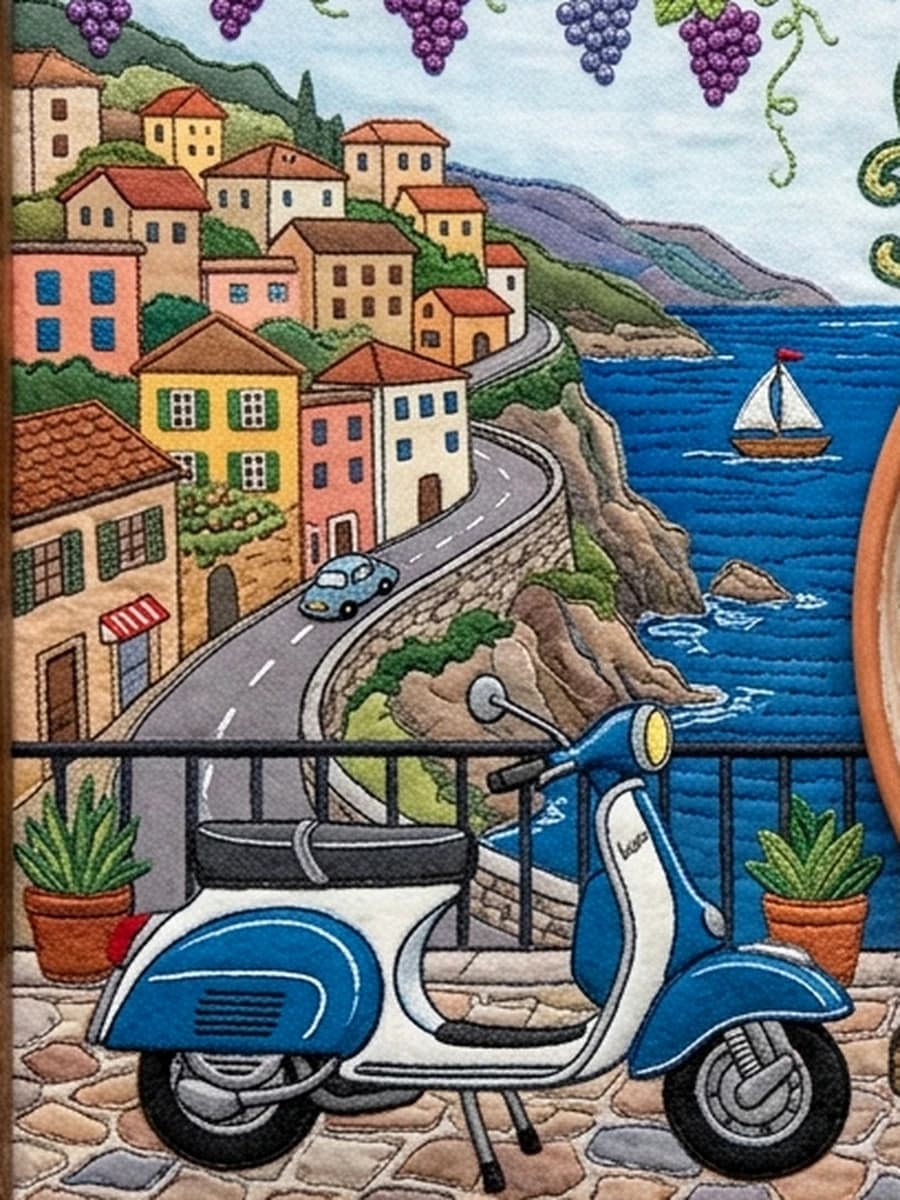
Our palette begins with materials rather than trend forecasts: roof tile, deep water, olive leaf, old plaster and the brown of a wood-fired table.
Those colors are useful because they already belong together in the physical world. They also map naturally to ingredients, which lets the brand and the food reinforce each other.
On screen we keep parchment light enough for long reading, reserve terracotta for action, and use sea blue as the stabilizing dark accent.
Atelier note: This journal uses local typed content by default. Add Sanity environment variables to switch the index to a remote read-only CMS source without changing page components.